Cold? Plain? Stainless steel is only of industrial style? In recent years, more and more lab-like interior designs present us with other amazing sides of stainless steel, changing the stereotype of this material. In this article, you will find out the high-end usages of the texture.
1\
A material of silver futurism
Its name, being “stainless”, is too functional to be fashionable while it is actually incredible and widely used in the avant-garde design since the day it was created. Until now, maybe it is because stainless steel has been too common in people’s life making people underestimate it and regard it as a normal material.
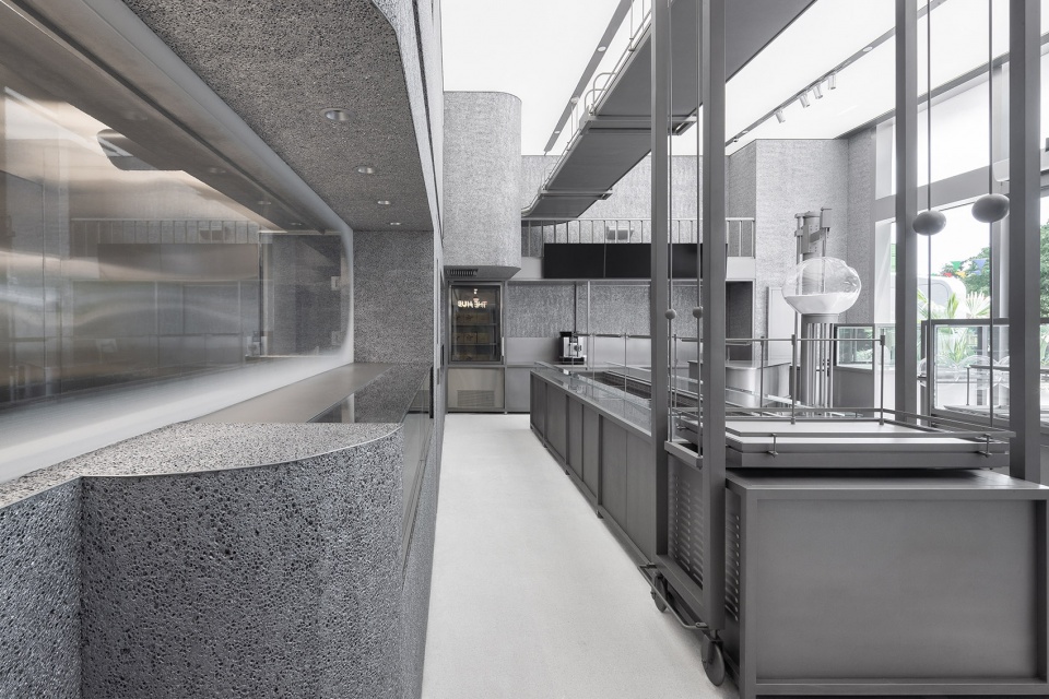
Das Lab is expert in using stainless steel. Inspired by the complexity of the post-industrial era, in Hollyland's concept store, the usage of stainless steel creates an interesting space with a sense of mechanical aesthetics.
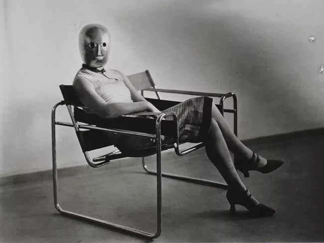
Earlier in the 20th century, stainless steel has become one of the favorite materials for many design masters to practice their imaginations.
In recent years, some lab-like indoor spaces have sprung up, attracting everyone's attention, and let us re-recognize the charm of stainless steel.
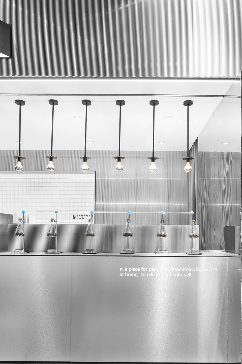
ITAFE’s takeout store designed by DAYLAB amplifies different functions of the space by using a large area of stainless steel.
- Transformation of stainless steel -
2\
A sense of order
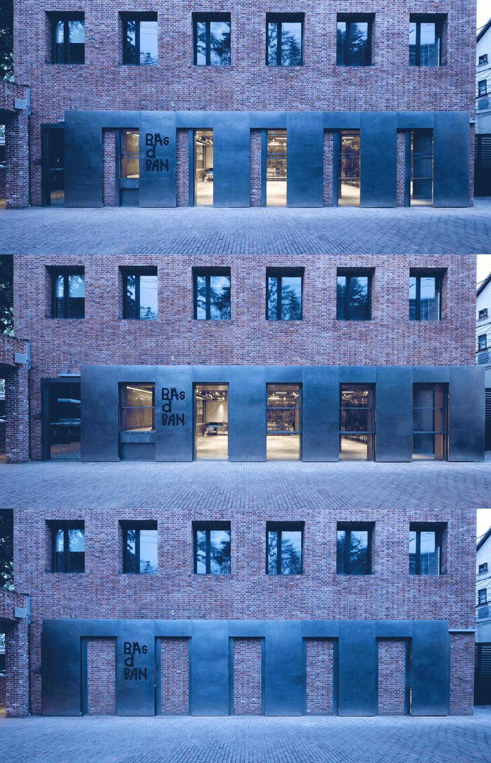
Designed by Dongqi, on the original brick wall of Basdban, a 12-meter stainless steel sliding door is added on the façade. The level stainless steel plate runs through the old building, giving a new and clean element to the traditional vibe.
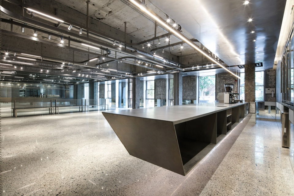
Indoor is an 8-meter stainless steel floating bar.
The texture of stainless steel can easily interpret the spiritual connotation of bold rebellion, forming a wonderful contradiction and professionalism in space.
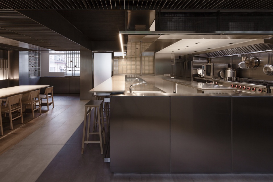
In the first Zentral Kitchen for Shikaku in Shanghai, the island kitchen set the professional tone. The normal Japanese wooden fence is replaced by the stainless steel screen, which maintains the consistently professional style. Meanwhile, in the open kitchen area, stainless steel is the best material to keep clean and sanitary.
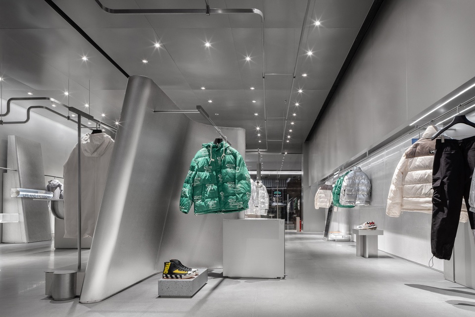
AND.G concept store
The original color of the metal stresses every piece of clothing.
The color of stainless steel can always show a pure texture, and through the artistic expression of designers, it makes people feel like they are in the high-tech atmosphere of a professional "experimental field".
3\
Surréalisme
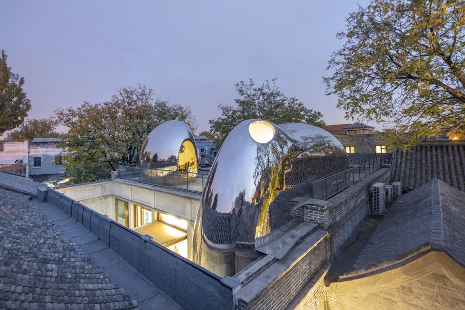
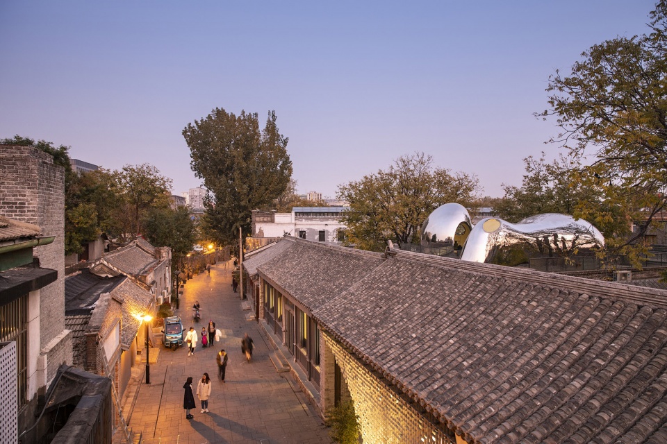
MAD transform a courtyard in the late Qing Dynasty located in Beijing, added three stainless steel “alien” bubbles into the courtyard. The surface reflects the old buildings, trees, and sky, giving new life and futurism to the old buildings.
Another major feature of stainless steel is its changeable surface, which can be used as a neutral background and can provide active visual effects, bring a constantly changing indoor environment, create a delicate and changeable sense of surrealism.
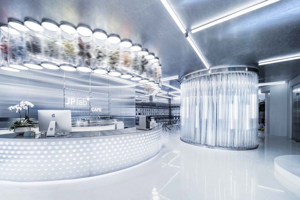
JP Lab, designed by XU Studio, a stainless steel combination display table conveys a technical feeling when then cold light projects on it and strengthen the existence of the products.
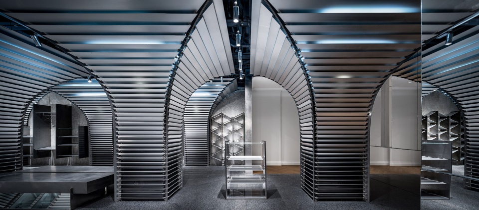
CONCEPTS, designed by Dongqi, the walls are built with concrete and mirrored stainless steel looks like a time tunnel.
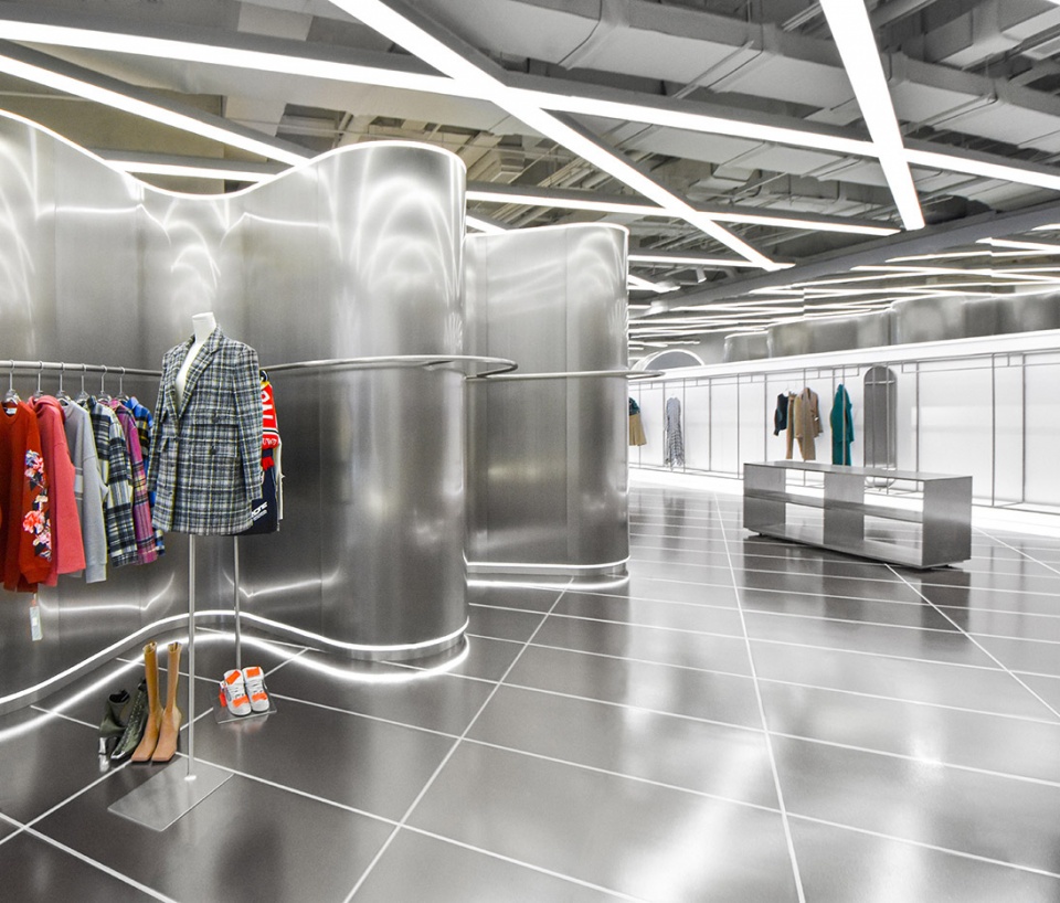
The curved stainless steel walls designed by RAMOPRIMO bring a magical visionary experience.
4\
Retroism
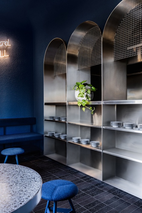
Located in Melbourne, in the community restaurant, Billie Buoy, the stainless steel bar and arched storage cabinets brings a retro atmosphere combined with the rose pink and neon lights reflected on the surface.
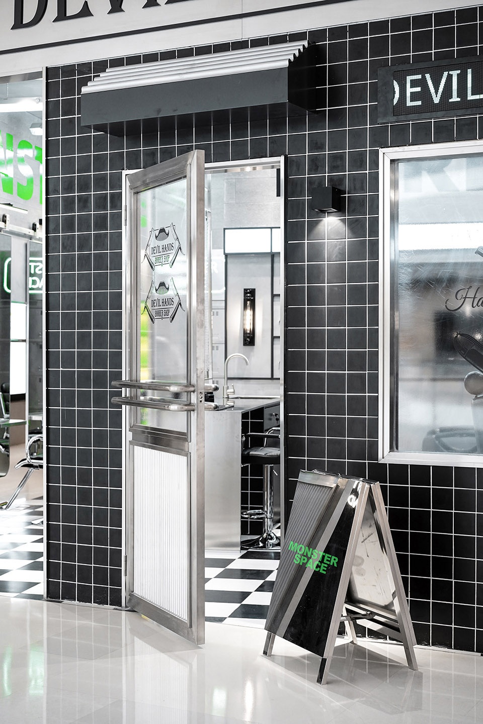
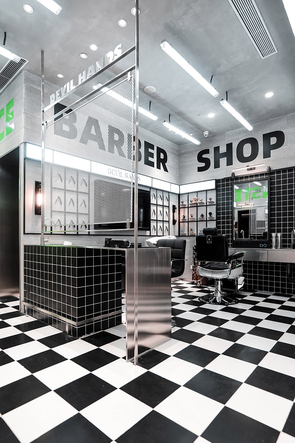
The barbershop, MonsterSpace utilizes classic black and white grid floor tiles and exaggerated wall plane matching with stainless steel elements to form a powerful visual impact.
Memphis design, known for an alternative style, also sparkles when using stainless steel.
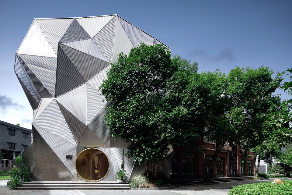
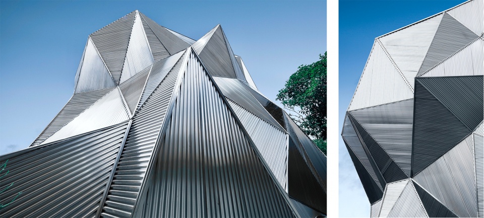
The YA space designed with corrugated stacking cliffs as the exterior design, with the geometric texture of stainless steel surface and the free composition, interprets Memphis's unfettered creative exploration.
Stainless Steel X Soft Clothing
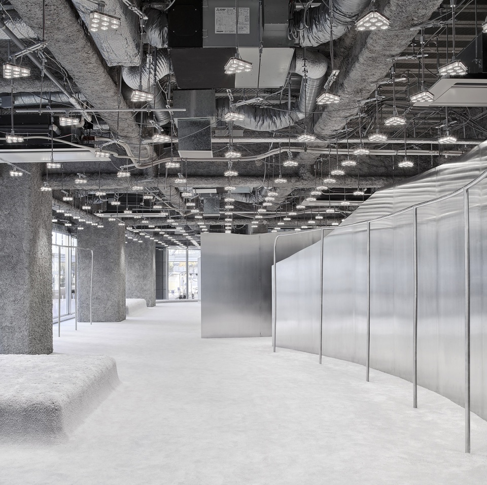
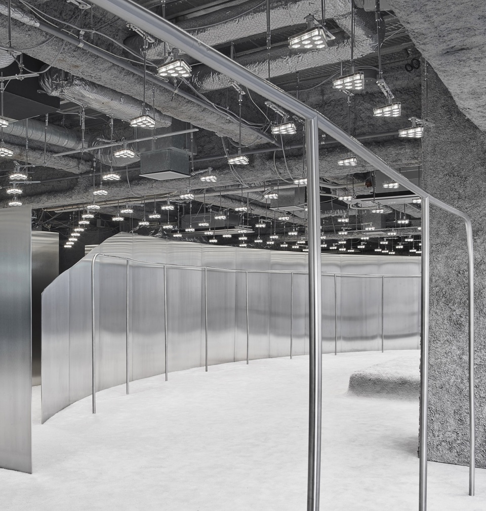
Acne Studios in Nagoya
The interior space is divided and intersected by three curved stainless steel thin walls. The mirrors and display racks are made of polished stainless steel panels, while the floor is covered with custom-made wool carpets, which form a sharp contrast between hardness and softness.
Although stainless steel is hard, it is extremely malleable. Therefore, once it is combined with soft materials, you can find a delicate balance between refinement and roughness, softness and hardness, exuding a contrasting tenderness. With the two different textures encounter, it creates an "iron soft" space.
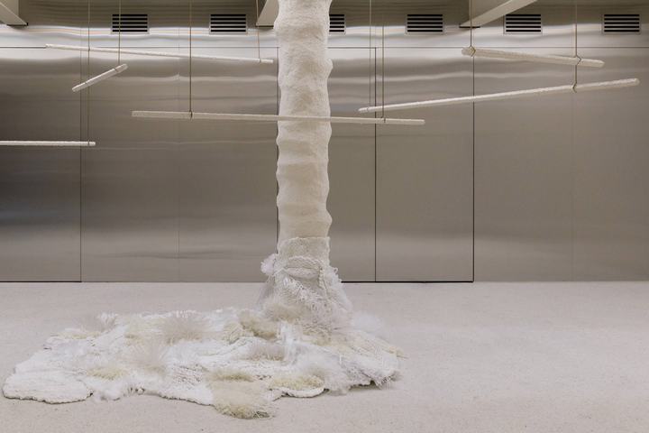
Andersson Bell, Soeul
The materials are either cold or hard, or thick, and the texture is soft or rough. The contrast creates a sense of fantasy in the space. The rigid texture of stainless steel and the delicate fabric texture are mutually inclusive, where it looks normal but we find poetry and surprise.
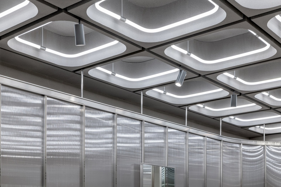
Wrapping the whole store by textured glass screen, it is extended to the ceiling by stainless steel connections
Stainless steel X Highly Saturated Colors
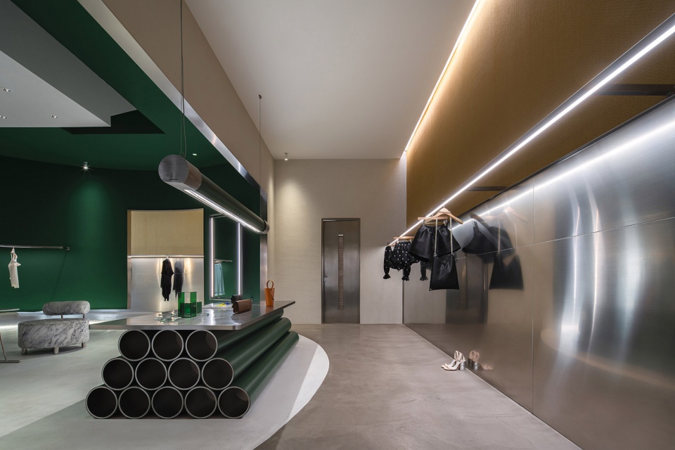
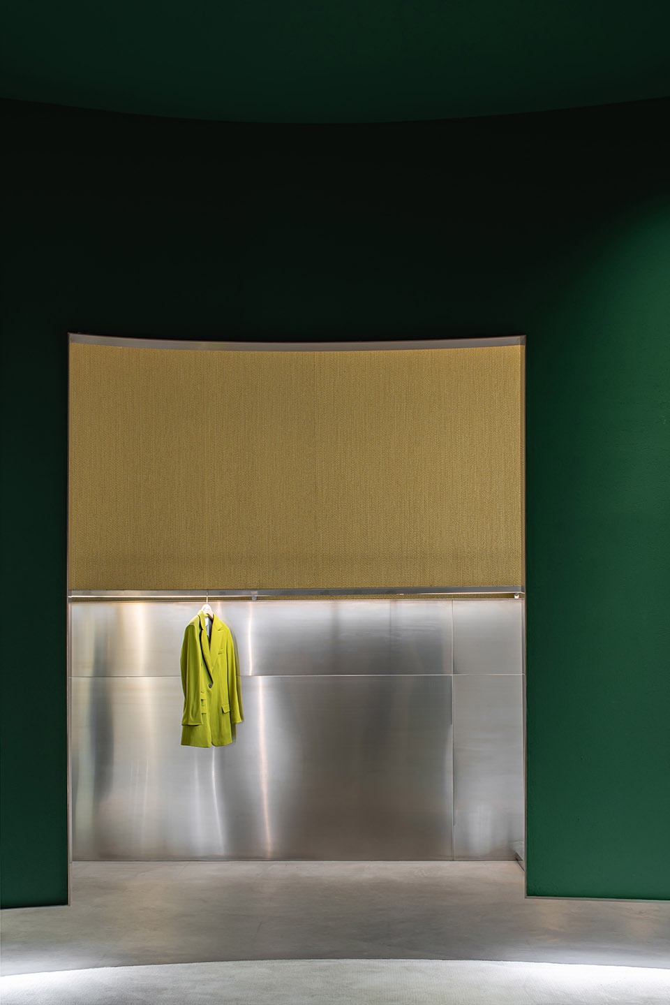
SOWHAT brand store fuses emerald green, yellow with the grey tone, rough concrete floor, and Matte stainless steel wall.
The combination of gray tones of stainless steel and high-saturation colors can collide with a strong sense of visual impact, providing a sense of ritual and rich layers for space.
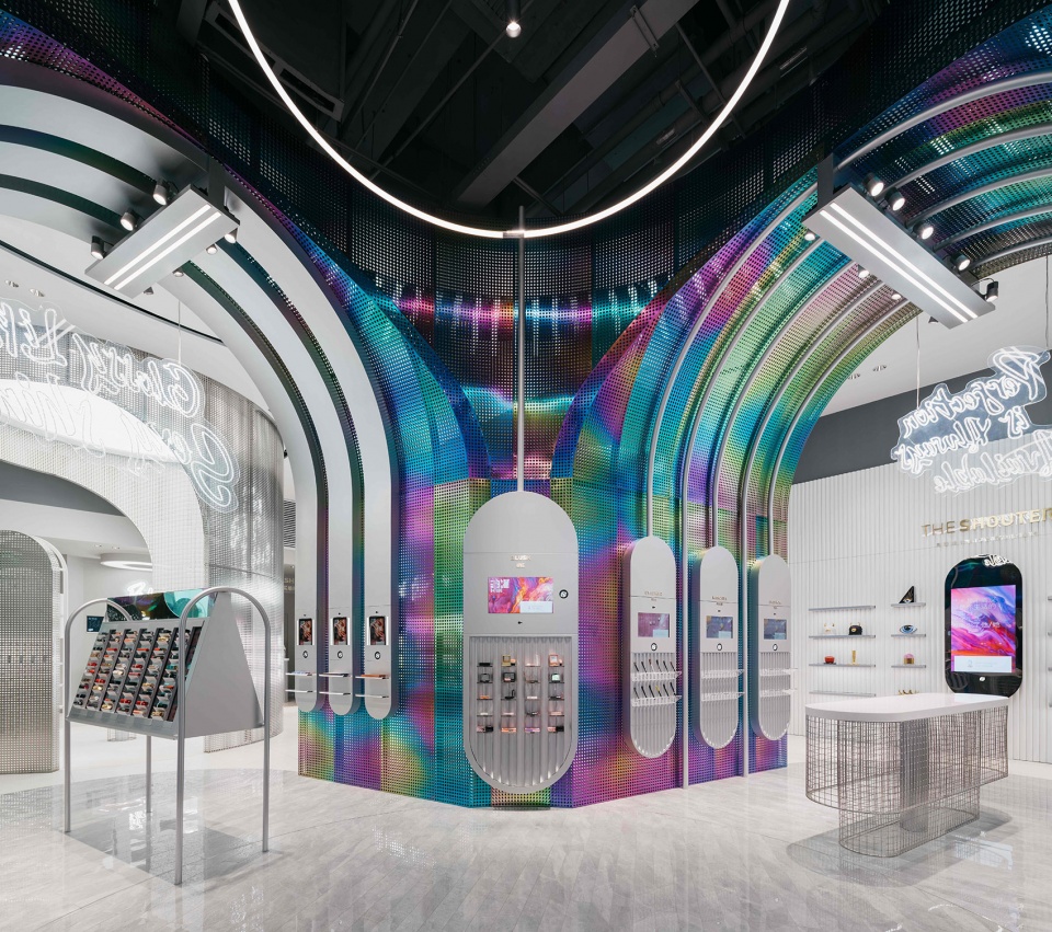
B+Tube designed by Storeage
In this new smart retail beauty store, the designer chose rainbow perforated stainless steel plates. In the semi-enclosed skincare area, brushed silver stainless steel and white acrylic are widely used, making the store a high-tech atmosphere like a laboratory.
Stainless steel X Stone
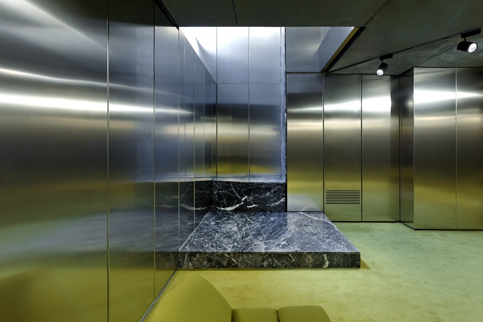
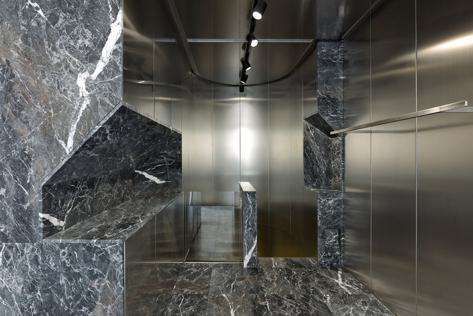
Enfants Riches Déprimés
This is a gray enclosed space, like a stage made of metal and stone, creating a sense of "coldness" atmosphere. The sculptural stainless steel wall creates space for the gray marble niche.
As a modern industrial product, stainless steel combines with natural marble, which also regards as a collision. The texture of the stone is projected on the stainless steel metallic surface, which not only expands the boundary of the space but also brings in a dramatic vibe.
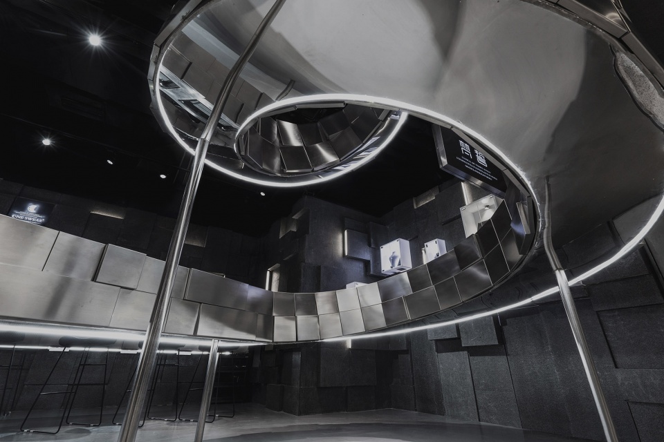
Fanshi of Suzhou Store is wrapped in dark gray stone. The center is the main body of the jewelry display rack. It is composed of scale-like stainless steel panels. Every angle reflects dazzling light, like a flying silver dragon.
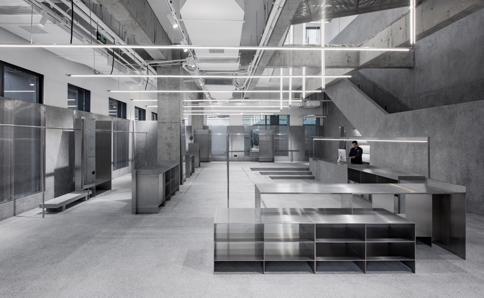
JHW Retail Store
Rough stone and smooth metal are juxtaposed together conveying a unique tension.
Stainless Steel X Wood
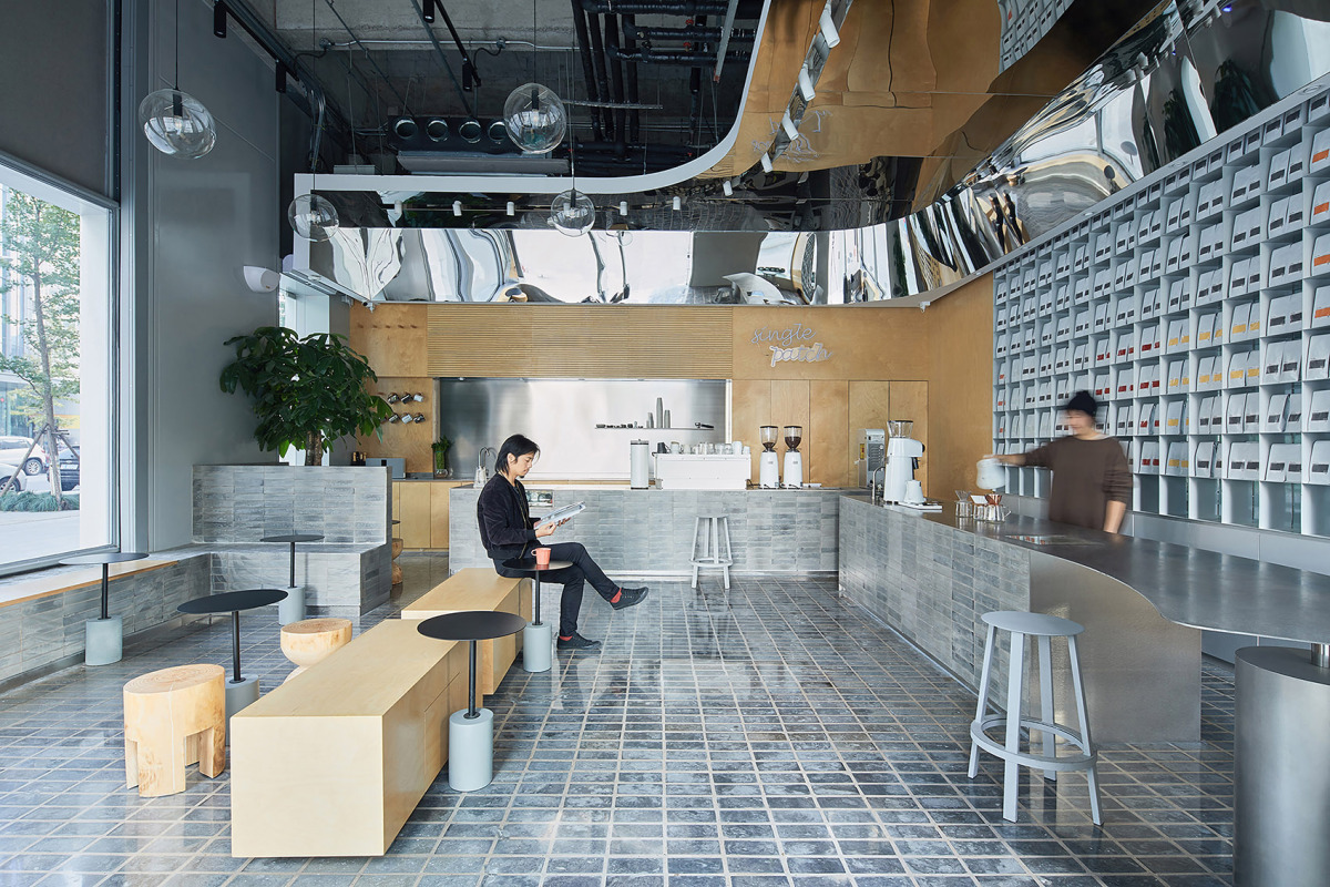
The corner pillars are covered by mirrored stainless steel, and the ceiling above the bar also adopts stainless steel.
The warmth of wood and the restraint of stainless steel are a perfect match. The quality of the wood balances the cold characteristics of the steel plate, which truly realizes the sensory balance of the space.
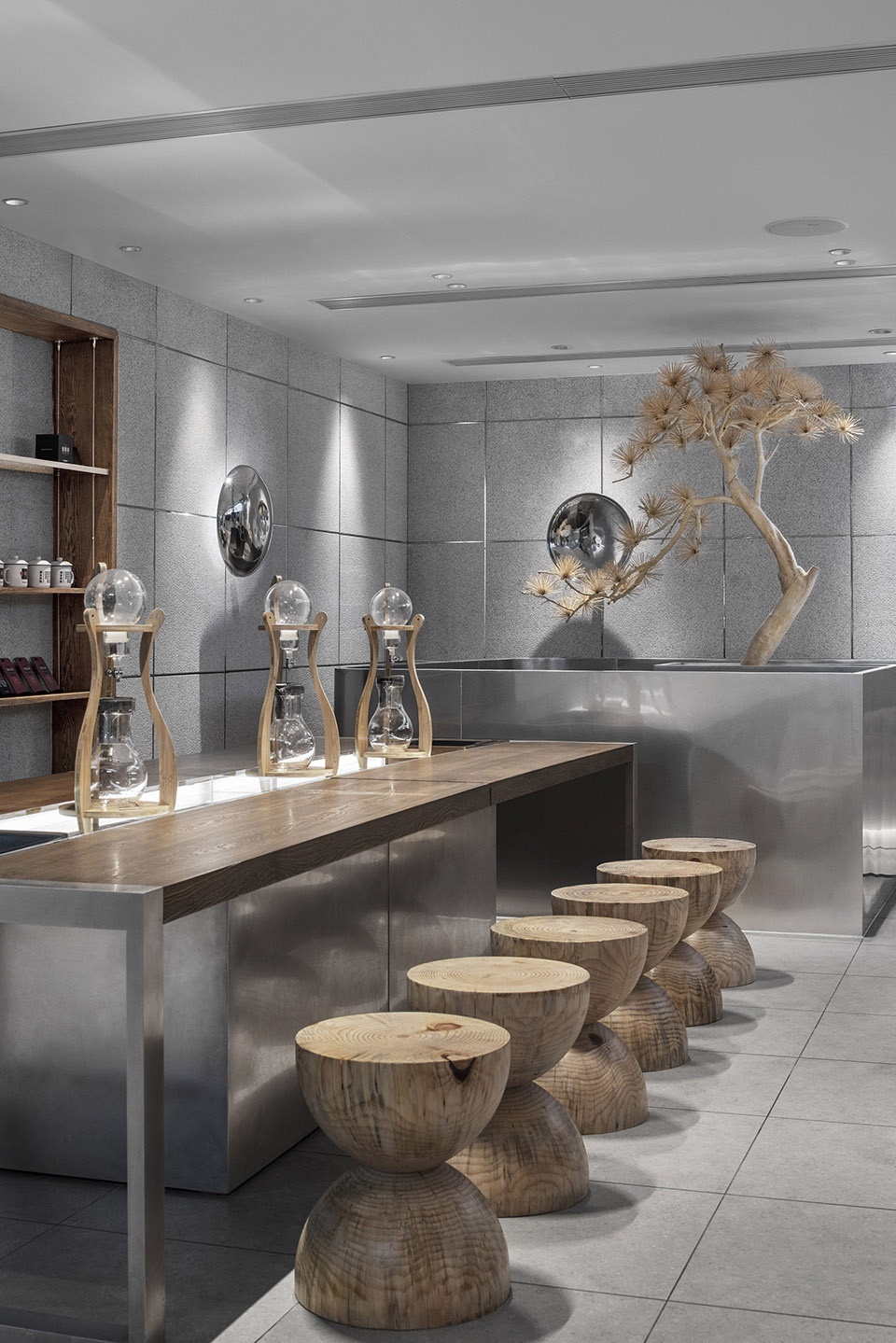
Inspired by chessboard, stainless steel brings a sense of order into the wooden table and chairs.
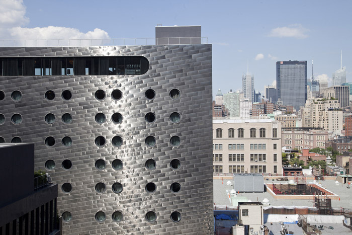
Dream Downtown, located in Manhattan.
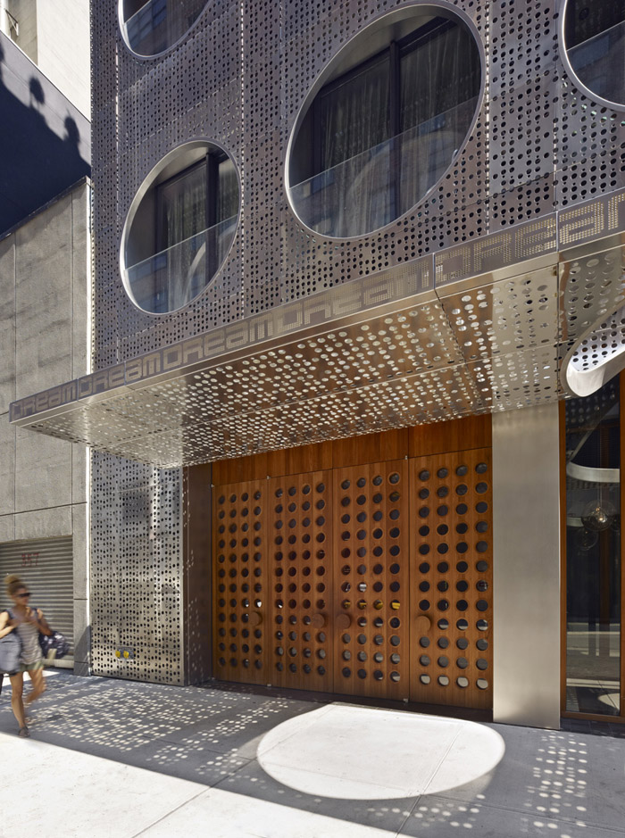
Handel Architects added a dazzling stainless steel facade to the building. The street, pedestrians, and natural environment are mapped out, with perfect light and shadow.
JINLING RECOMMENDS:
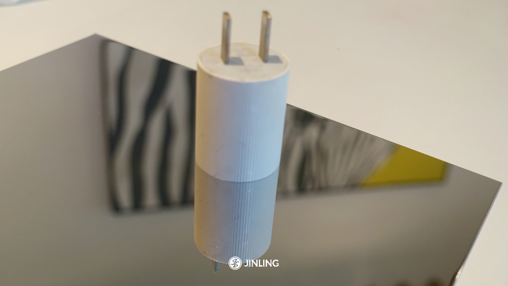
1. 8k mirrored stainless steel sheet
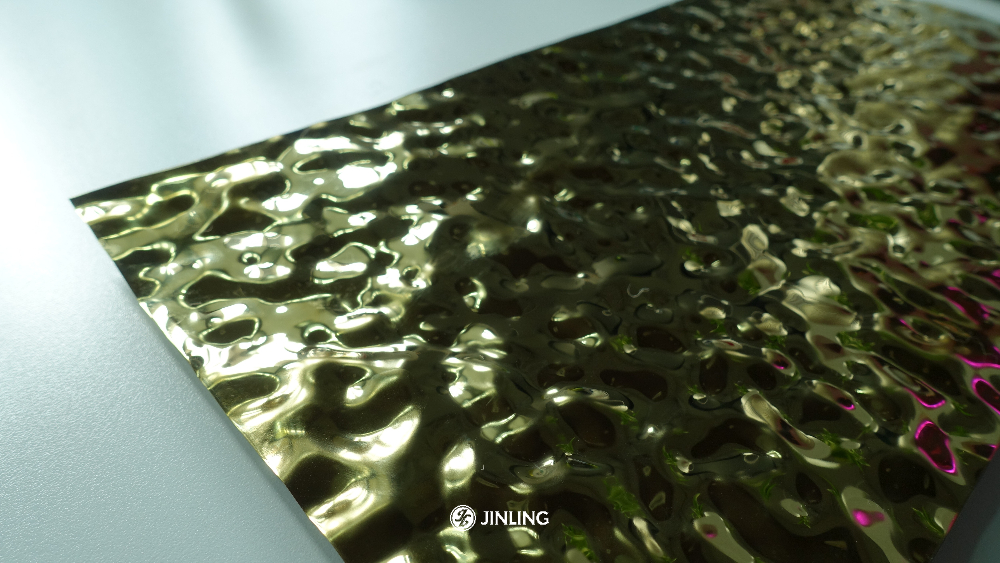
2. Wavy stainless steel sheet
3. Weaving stainless steel
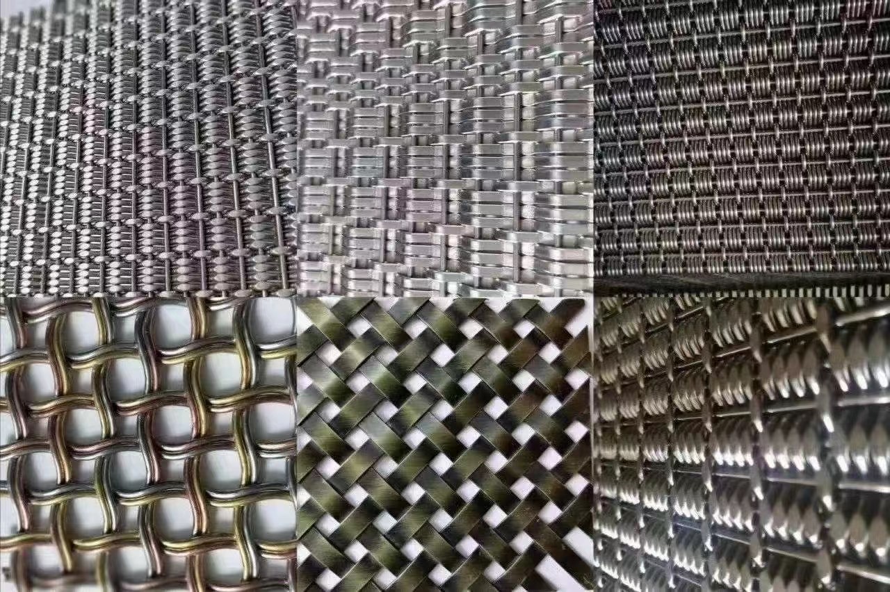
Stainless Steel DesignsStainless Steel DesignsStainless Steel DesignsStainless Steel DesignsStainless Steel Designs
